
Safety & Health Information: Improving Online Access & Delivery
Summary Statement
This article, published in Professional Safety magazine in May 2014, reviews the systematic methods employed by a multi-disciplinary team at CPWR to upgrade the look and functionality of their website called the Electronic Library of Construction Occupational Safety and Health (eLCOSH). Meant to be a repository of a broad range of materials, eLCOSH provides more than 2,000 resources, including articles, tool box talks, images and PowerPoints to help stakeholders better protect construction workers. To minimize search time, the team conducted research to determine stakeholder priorities and search approaches.
Data collected before and after the revisions reveal
that the changes made data retrieval faster, more efficient
and more meaningful to users.
May 2014
In Brief
- Electronic Library of Construction Occupational Safety and Health provides more than 2,000 resources to help stakeholders improve construction safety and health. To minimize search time, the site was redesigned and restructured to determine stakeholder priorities and search approaches.
- Data collected before and after the revisions reveal that the changes made data retrieval faster, more efficient and more meaningful to users.
- Whether creating a poster, brochure, instructions or website, a label definition task or label-item matching task can provide information on whether keywords are understood by the audience.
In 2000, Center for Construction Research and Training (CPWR) launched the electronic Library of Construction Occupational Safety and Health (eLCOSH) as a free online source of research and training information on the topic of construction safety and health. By 2010, it had grown to contain nearly 2,000 items, with more than 30,000 unique visitors each month, including safety and health professionals, researchers, workers, contractors and trainers. The site’s content had also diversified.
For example, a search on noise brings up presentations, videos, images of noisy situations, toolbox talks, handouts for use by trainers or employers, as well as recent research findings and studies on noise and hearing conservation.
The online source was created with a strong focus on both worker and researcher accessibility and use, and the site has proven quite valuable to a range of practitioners. Trainers are major beneficiaries and avail themselves of the nearly 1,000 images described and clearly labeled as either good or bad practices. Trainers are encouraged to use these images freely in their own presentations or to use one available on eLCOSH. Site safety practitioners regularly download toolbox talks to educate workers on construction sites. A new series of 52 toolbox talks developed in conjunction with NIOSH represents the first set of tools incorporating elements shown to be effective through research. Researchers appreciate access to 130 research reports on eLCOSH, particularly since finding specific research without eLCOSH is often time-consuming.
As the site’s user base became more diverse and the content expanded, the site became more difficult to navigate. Although eLCOSH continued to be widely used, an evaluation of its use and usability, user comments and informal testing revealed several limitations to user experience and, as a result, the site’s value. Some issues were structural, while others related to the detail level provided in a search or to the format of search results. Selecting terms to describe hazards became especially complex due to the expanded and diverse group of end users.
Development Process
A four-member study team, including CPWR staff and consultants, used various methods to determine how to best address these issues. These included structured meetings with users; a variety of usability testing techniques; a detailed review of the website’s functionality and back-end structure for categorizing content; and an analysis of terms commonly used to describe construction hazards. Testing results were used to modify the home page, restructure the browse and search features, and reconfigure the structures for categorizing and displaying items retrieved. Proposed changes were tested using a sequence of wireframe prototypes at each development stage. (A wireframe is a mock-up of a small set of pages that includes simple navigation between them to provide the look and feel of a site without building the underlying structure.)
A work group was established to provide structured feedback, and testing was incorporated into each phase of the development process. For both the work group and the testing phases, the study team recruited representatives of eLCOSH users, as well as those unfamiliar with the site but who could benefit from the resource. These populations included:- apprentice instructors;
- researchers/academics;
- safety and health professionals;
- contractors, workers and other industry stakeholders.
The study team used various methods to gather user input (Table 1).
| Method | No. of People | Process | Goal |
|---|---|---|---|
| Work Group | 22 | Directed discussion to explore goals that users want to accomplish on site and features they want to see. | Helped determine what to emphasize on the home page and what browsing options to include. |
| Card Sort | 10 | Place items individually on index cards. Ask users to sort cards that go together into piles. Label piles. | Helped determine how a group of items such as hazards can be subdivided into smaller groups that make sense to users. |
| Label Definition | 18 | Present a potential category and ask users to define it. | Helped determine category titles and items to include in the category. |
| Label/item matching | 9 | Provide a number of items and category labels. Ask users to match the item to the category to which it belongs. | Provided feedback on users’ concept of categories and labels. For example, provide labels training materials and research papers along with items from the database. See which items are placed in each category. |
| Item ranking | 39 | Give users a list of items and ask them to select five that are most important and five that are least important to them. | Provided input on items to emphasize on the home page. |
| 5-second test | 11 | Present a page to users for 5 s then ask what they remember about the page. | Assessed whether items that are important to users can be easily detected. For example, determined whether users can easily find the search button on the home page. |
| Think-aloud protocol | 11 | Provide a realistic prototype and a set of tasks to be accomplished on the site. Ask users to perform the task while saying out loud what they are thinking. | Provided information on overall usability of site as well as specific information on elements such as menus and labels on pages. For example, determine whether the user can find a specific hazard and how many clicks it takes to get to the hazard. |
| Timed test | 10 | Ask users to find 10 hazards on the old system and the new one. | Assessed the ease of finding hazards on the two systems. |
These techniques provided valuable insight into the needs of different types of users and helped the team increase the site’s usability. These techniques could be applied to other online resources and forms of communication such as handouts and posters.
The site’s design and operation were also guided by the need to comply with the U.S. Department of Health and Human Services’ (2013) Digital Communications: Section 508 to ensure that the site is accessible to people with disabilities.
Categorization
Information from the work group suggested that users want to find items specific to a hazard, trade or job site. The work group also was interested in finding information quickly, such as photos, presentations and training materials. Based on this feedback, the study team focused on the following broad categories:- hazard;
- trade;
- job site;
- media type;
- document type.
On the original website, users could browse through items by selecting a hazard, trade or job site. Trade and job site categories were fairly intuitive and users knew what they would find by clicking on these categories. In contrast, users had a limited understanding of, or agreement on, what they would find by clicking on one of the hazard categories. Under the original hazard hierarchical structure, the top-level hazard categories were biological, chemical, musculoskeletal, physical, safety and other. As the website’s content expanded, new layers were added to accommodate items that did not fit clearly into one of the top-level categories.
The resulting hierarchy was complex and difficult to understand. Each of the six original top-level hazard categories was developed into its own tree structure with anywhere from five to 25 items below it. In addition, the other category multiplied; by the time the redevelopment project was undertaken, 10 additional other categories were created.
An analysis of items that could be considered musculoskeletal or ergonomic illustrates the issue. These two categories contained 122 items related to musculoskeletal or ergonomic topics, spread over 15 subcategories. Even if the user knew exactly where to find an item, it would take multiple clicks to retrieve it. However, confusion as to where to look caused many more clicks. (Additional information on the number of clicks required to find 10 items is discussed later in this article.)
One goal of the redevelopment process was to reorganize and remove all of the other categories and avoid using separate titles for similar hazards. A review of categorization schemes used by other safety and health groups revealed various approaches in use and little consistency among them (Table 2).
| Organization | Categories |
|---|---|
| NIOSH |
|
| Canadian Center for Occupational Health and Safety |
|
| Washington State Department of Labor and Industries, Division of Occupational Safety and Health |
|
| OSHA construction area |
|
| OSHA publications area |
|
On the NIOSH site (2013), information is organized into industries and occupations; hazards and exposures; diseases and injuries; safety and prevention; chemicals; and emergency preparedness and response. Canadian Centre for Occupational Health and Safety (2013) sorts by topics: chemicals and product safety; ergonomics and MSDs; healthy workplaces legislation and regulatory compliance; workplace violence; and young workers. Washington State Department of Labor and Industries, Division of Occupational Safety and Health (2013) provides three categories: health and workplace diseases; ergonomics; and chemical safety. The site also provides an option to search alphabetically. In the construction section of OSHA’s site (2013a), topics are organized by regulatory standard and include sections such as mold, and hand and power tools. In OSHA’s publication section (2013b), publications are organized alphabetically; however, finding a particular item may be difficult. For example, a user interested in noise will not find it under N, rather it is located under an occupational noise exposure section (2013c).
Given the apparent lack of standardized terms and categories, the study team employed various techniques to identify hazard category groupings that are meaningful to eLCOSH users. Ten users, including safety and health trainers, industrial hygienists and researchers, participated in a card sort of 33 of the 71 system subcategories (Spencer, 2004). Some categories were well-known (e.g., falls), while others were less common (e.g., stress). Users were told to place the cards into piles that made sense to them, then label the piles by category. The number of categories created by participants ranged from 4 to 9. Using a technique described by Spencer (2004), an attempt was made to standardize the categories and look for areas of agreement across participants. If all users agreed that the same items should be placed together, the score would be 1. A score of 0 would indicate no agreement. The results of this exercise are in Table 3.
| Standardized category | Agreement |
|---|---|
| Ergonomics | .47 |
| Chemical (particulate, gas) | .31 |
| Physical hazards | .30 |
| Outliers | .18 |
| Safety | .18 |
A category including items related to ergonomics had the highest level of agreement, with a score of .47. The others ranged from .18 to .31. There is no typical score in card sort tests, but it is not uncommon to see scores above .50. Scores below .31 indicate little agreement among participants. Looking more closely at individual results provided some insight into the disparities.
For example, half of the participants put dust and asbestos into the same category, while the other half put them into different groups. Six of the 10 put slips and trips into the same category as falls, but four put them in different categories. An analysis of the labels placed on categories as well as the comments made during the task revealed differences in mental models that helped explain the variability. Neilsen (2010) provides a background on the definition, use and utility of mental models as they relate to human-computer interaction. Briefly, a mental model is a user’s mental representation of a system, which determines his/her expectation of how the system will operate. The mental models that were observed by the study team are presented in Table 4.
Participants' mental models help explain variability when grouping categories.
|
|---|
Through this process, it became clear that there was no single or common way that users categorized hazards. While some users focused on a hazard’s characteristics as the most important category determinant, others considered factors such as where or when the hazard is found, commonality of the hazard or the hazard’s impact on the worker. Still, others looked at cause-and- effect relationships between hazards (e.g., scaffolds should be with falls because one impacts the other).
A test was conducted to see whether the number of items and categories could be reduced to a small enough number so that all items could be viewed at once in a megamenu and still be easy for the user to read and understand (Neilsen, 2009). A detailed analysis of the categories and subcategories was performed to identify areas of overlap, remove categories with small numbers of items and organize the remaining items into a smaller number of categories based on the terms used by participants in the card sort. The resulting categories were ergonomics, work environment and inhalation/skin exposures. The number of items under the categories was reduced from 71 to 34.
These categories and the megamenu layout were tested with users at each stage of the website’s design and programming.
Media & Document Types
Through the sessions and item-ranking tests the study team learned that users often look for specific formats or types of items depending on their backgrounds (e.g., trainers look for training materials, videos, presentations and handouts; researchers search for published articles and research reports). Under the original structure, all items were categorized into one of three formats, video, document or image, with the majority falling under the document category. Searches often resulted in lengthy lists of titles with no indication of whether an item was, for example, a presentation, an article or a research report. Based on the work-group input, the study team created another category level to help users quickly find items by format or type.
Various terms used to identify content were tested to understand how users think about formats or types of items. Eighteen users participated in a label- definition task in which they were given a list of possible content labels related to media and asked to describe what type of item or format they would expect to find for each. It was determined that the label media would be a good main category since all users said they expected media to include items such as videos, images or podcasts.
Next, the study team analyzed the library’s content and identified 20 potential document subcategories. Initially, users were given subcategory names and asked to supply a definition. A summary of selected results is in Table 5.
| Category | Percentage of people with consistent definition |
|---|---|
| Government requirements | 100 |
| Handouts | 100 |
| General reference | 33 |
| Research reports | 100 |
| Toolbox talks | 94 |
| Training materials | 100 |
| News articles | 100 |
| Abstracts and summaries | 57 |
| Recalls | 86 |
Next, label-item matching tests were conducted. Users were given a title and a sentence description of 33 items from the library, then were asked to place each one in a document subcategory. The test was refined and rerun several times until the list had been pared down to six items. At that point, nine users participated in a final test. Table 6 provides a summary of findings.
| Percentage of items | Percentage of agreement |
|---|---|
| 79 | >50 |
| 51 | >60 |
| 45 | >70 |
The results show more than 50% agreement on item placement for 79% of the items. Agreement was more than 60% on 51% of items and more than 70% on 45% of the items. Based on these results, nine final categories were selected.
Designing the Home Page
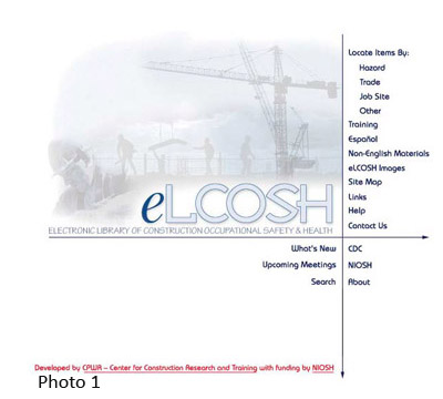
The study team conducted various tests to determine whatitems to emphasize on the new home page and how best to place them. Photo 1 illustrates the original home page. Thirty-nine users participated in an item-ranking task to determine which items to emphasize on the home page. They represented a broad cross-section of users. The users were given a list of 18 options and asked to select their top five and bottom five items.
| Items ranked in top and bottom | Overall score | % in top five | % in bottom five |
|---|---|---|---|
| Find information organized by hazard | 431 | 74 | 29 |
| Find training materials, including hanouts | 371 | 80 | 29 |
| Use a search box | 364 | 57 | 54 |
| Find presentations/PowerPoints | 351 | 69 | 40 |
| Find images/photos on particular subjects | 294 | 69 | 37 |
| Find videos on particular subjects | 289 | 69 | 40 |
| Find information organized by trade | 261 | 57 | 46 |
| Find information about safety tools and equipment | 225 | 37 | 63 |
| Links to safety and health information from OSHA and MSDS sites | 207 | 51 | 49 |
| See what's new, including hot topics and most viewed pages | 168 | 37 | 54 |
| Find information on standards and regulations | 137 | 29 | 74 |
| Frequently asked questions | 101 | 14 | 80 |
| Sign up for electronic notification about a new post on specific topic | 101 | 17 | 91 |
| Find information organized by type of job site | 90 | 31 | 71 |
| Provide feedback or suggestions | 76 | 20 | 86 |
| See what's available in different languages | 53 | 11 | 89 |
| Communicate with other eLCOSH users | 42 | 11 | 91 |
| Spotlight an item from within eLCOSH | 38 | 9 | 100 |
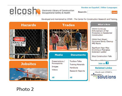 In addition to the key categories (i.e., hazards, trades, job sites, media, documents), other items were highly rated. These are illustrated in the new home page in Photo 2. The study team conducted a 5-second test (Sauro, 2010) of a home-page prototype using these categories and terms. After viewing the home page for 5 seconds, eight users were asked to name the items they recalled. Six users remembered seeing hazards during the test, five noted seeing the media and documents menus.
Additional information was gathered from 11 users, including the eight who participated in the 5-second test, using a think-aloud protocol (Rubin, 1994) with a more detailed multiscreen prototype to search for items. Results are described in the following relevant sections.
Narrowing Search Results
In the original version of eLCOSH, a user could only find an item by keyword search or by browsing through a single category such as hazards. The results often returned long lists. For example, a keyword search for falls returned 1,200 items, which were presented in alphabetical order by title. When browsing, results were more limited but still lengthy. Changing the back-end structure for categorizing content resulted in the removal of duplicates from the results, but the lists were still long. For example, a keyword search for falls in the new system returns 562 items.
The study team modified the search results display, adding a feature to allow users to filter their search results by one or more of the categories and subcategories of interest—hazards, trades, job sites, media and documents.
For example, a user performing a browse or keyword search on falls would have the option of narrowing the results to those most relevant to a specific trade, type of job site and/or type of item such as toolbox talks. The underlying website structure for categorizing content was changed to accommodate these filters and the feature was then tested.
Testing the Filters
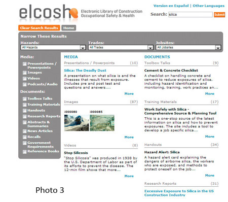 Several variations of the multipage prototype and filters were tested by 11 users with a thinkaloud protocol. Users could see items placed into categories after an initial search, then could narrow the search to particular categories by using a series of check boxes to the left of the search results. Photo 3 displays the interface used for this test. In this photo, results from a search for silica are displayed. Media and documents are divided into separate groups in the menu on the left. For both a keyword search and browse, all available items are organized by media/document group in the center of the page.
For example, under media, presentations/powerpoints and images are listed. Under documents, toolbox talks and training materials are listed. Clicking on an item in the menu narrows or expands the results to those subcategories selected. The user can select any combination of items from media and documents.
The following is an example of the tasks that were given to the users:
- Browse for silica from the home page.
- Look for items that could help put together a training session for workers on silica.
- Modify the search to include other materials in addition to silica.
- Look for information about silica that is relevant for bricklayers.
- Switch to information relevant to all workers.
Photo 4 shows partial results when users narrowed their search 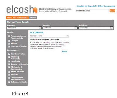 to toolbox talks for silica. Abstracts and summaries, news articles, recalls, government requirements and reference books are not visible. All individuals tested were able to narrow by document type using the check boxes. Most found the check boxes without prompting. User comments revealed that they understood the layout and functionality/narrowing technique.
The user can also narrow to a particular hazard, trade and/or job site by selecting an item from the corresponding menus across the top of the page. To illustrate (Photo 5), the user has selected bricklayer under trades. Items presented now are narrowed to those relevant to bricklayers.Using the version of the interface from Photo 3, all users were able to navigate through the tasks successfully.
The use of the new filtering capability 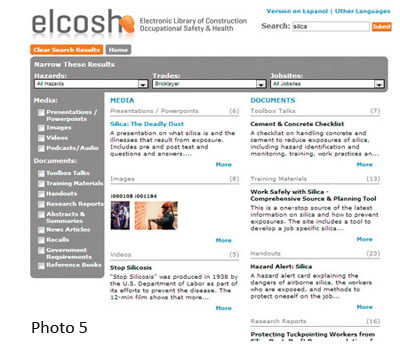 makes a significant difference in users’ ability to find items of interest. The search for falls, which returned 1,200 alphabetized items in the old system, now returns much more manageable and useful lists such as 35 toolbox talks and 45 handouts. In addition, each item retrieved now includes a brief description; this eliminates the need for the user to click on each item to determine whether an item meets his/her needs.
Old vs. New Design & Functionality
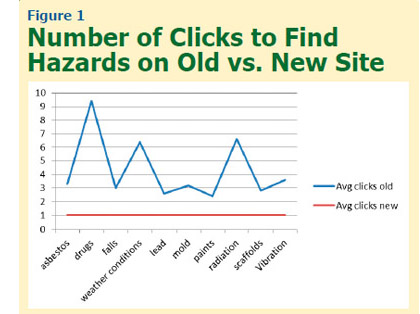 After a more complete prototype of the redesigned website was constructed, a study was conducted comparing the old and new systems. Six apprentices and four instructors were asked to find 10 hazards on each the old and new system. The hazards included items that were pulled from several different categories, some common (e.g., falls) and others potentially harder to find (e.g., drugs). The order of presentation of systems was counterbalanced and the order of presentation of hazards was different for each user. The number of clicks required to find each hazard was tabulated and the time taken to find all 10 hazards was measured. The hazards presented and the average number of clicks to find each hazard are illustrated in Figure 1.
In the old system, the number of clicks varied from 2.4 for 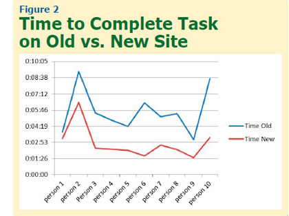 paints to more than 9 for drugs. In contrast, all users found each hazard in one click on the new system. A paired t-test comparing old and new systems revealed that the difference was significant (p = .0003).
Users took from 3 minutes and 7 seconds to more than 9 minutes to complete the task on the old site, compared to only 1 minute and 31 seconds to 6 minutes and 28 seconds on the new site (Figure 2). The difference on a paired t-test was significant (p = .0014). These results suggest that the new categorization scheme and presentation method provide a significant improvement over the old system.
Providing a Higher Level of Information for the User
Based on the prototype testing, the study team added more features to the site to help users find information of interest. One addition was the listing of the number of items available in a category. Another addition was a “More like this” feature, which required tagging each item with additional items of a similar nature. Links to a companion website, when appropriate, were also included.
Conclusion
Although the information in eLCOSH focuses on construction safety and health, testing revealed that the way users think about and approach the information is quite diverse. The work-group discussions and various usability testing techniques helped the team identify categories and terms that are meaningful to users. With additional usability testing, the team crafted a system that is more transparent, easier to navigate, and more valuable for users of diverse needs and skill levels. These changes have allowed eLCOSH to reach a broader audience, and made the content easier to maintain and expand as items are added.
By ensuring that words and search mechanisms are clear, understandable and easy to use, construction industry stakeholders are now in a better position to improve construction safety and health. The techniques used in this work can be applied to many different situations. Whether one is creating a poster, brochure, set of instructions or website, a label definition task or label-item matching task can provide information on whether keywords are understood by the audience. A 5-second test is fast and easy to use when assessing any website’s home page. A think-aloud protocol provides information on how effective an application, website or training manual is and how to improve it.
Authors
Sharon Garber, Ph.D., is an independent consultant focusing on construction safety, usability, customer analysis and social media. She spent 23 years at 3M Corp. in research and development where she led the first program sanctioned by OSHA to allow a worker to be medically certified online to wear a respirator, and developed an expert system that converted the knowledge of industrial hygienists into a program for safety officers. She has received 13 patents, including the first software patent awarded to 3M. More recently, she helped the Center for Construction Research and Training (CPWR) create an ROI calculator and helped renovate the electronic Library of Construction Occupational Safety and Health (eLCOSH). She holds degrees from the University of Minnesota in Computer Science (M.A.) and Communication Science (Ph.D.).
Eileen Betit is the director of special programs and a member of the National Construction Center’s research-to-practice program team for CPWR. She has more than 25 years’ experience working with construction contractors and workers on safety and health issues, and developing communications tailored to their needs, including websites and products targeted for increasing their acceptance and use of safer work practices and equipment. She is a member of American Public Health Association and American Society of Assocition Executives. She earned a B.A. in Economics from the University of Vermont, and has done graduate-level work in accounting and finance through American University.
Mary Watters, M.F.A., is director of communications for CPWR. She oversees CPWR’s output of publications, press and digital media. Her previous position was as creative director for a Washington, DC, public relations and communications firm. Watters holds a B.S. in Education with a specialty in English and speech from Concord College and an M.F.A. in Theatre/Stage Direction from Catholic University.
Bruce Lippy, Ph.D., CSP, CIH, is director of safety for CPWR. He earned a B.A. in Biology from Western Maryland College and a Ph.D. in Policy from the University of Maryland. In his current position, he manages eLCOSH. He previously directed the National Institute of Environmental Health Sciences’ National Clearinghouse for Worker Safety and Health Training. He is a member of the Joint Industrial Hygiene Ethics Education Committee and the AIHA Nanotechnology Working Group; he is also a professional member of ASSE’s Chesapeake Chapter and a frequent speaker for the Society.
References
Canadian Centre for Occupational Health & Safety (CCOHS). Retrieved from www.ccohs.ca
Maadmob. Card sorting analysis spreadsheet. Retrieved from http://maadmob.com.au/resources/card_sort_analysis_spreadsheet
Neilsen, J. (2009, March). Mega menus work well for site navigation. Retrieved from www.nngroup.com/articles/mega-menus-work-well
Neilsen, J. (2010, Oct.). Mental models. Retrieved from www.nngroup.com/articles/mental-models
NIOSH. (2013). Workplace safety and health topics. Retrieved from www.cdc.gov/niosh/topics/default.html
OSHA. (2013a). Construction industry. Retrieved from https://www.osha.gov/doc/topics.html
OSHA. (2013b). Publications. Retrieved from www.osha.gov/pls/publications/publication.html
OSHA. (2013c). Occupational noise exposure. Retrieved from www.osha.gov/SLTC/noisehearingconservation/index.html
Rubin, J. (1994). Handbook of usability testing: How to plan, design and conduct effective tests. New York, NY: John Wiley & Sons Inc.
Sauro, J. (2010, Nov.). 5-second usability tests. Retrieved from www.measuringusability.com/five-second-tests.php
Spencer, D. (2004, April). Card sorting: A definitive guide. Retrieved from http://boxesandarrows.com/card-sorting-a-definitive-guide
U.S. Department of Health & Human Services (HHS). (2013). Digital communications: Section 508. Retrieved from www.hhs.gov/web/508/index.html
Washington State Department of Labor & Industries. (2013). Safety. Retrieved from www.lni.wa.gov/Safety/default.asp